A visual identity and packaging design for a wine brand.

Project Information
Client YUVA
Our services
Branding & Visual Identity
Graphic Design
Typeface Design
Packaging Design
Graphic Design
Typeface Design
Packaging Design
YUVA is a new wine brand that combines the heritage of the grapes and a contemporary approach to produce boutique wines.

About the Project
YUVA is a new vineyard specialized in the creation of unique, authentic and tasty wines for all people. Their goal is not only to attract wine experts but also beginners who appreciate good quality wines and the lifestyle that goes with enjoying them.
We helped them to design their new visual identity and to position their wines as high quality lifestyle products.
We helped them to design their new visual identity and to position their wines as high quality lifestyle products.
Conceptual Idea and Goal
The overall goal of the creative direction was to pay tribute to the heritage of the products – the grapes and to create a reduced, still recognizable visual system.
The latin word UVA translates to grapes. To archive a memorable, distinctive and recognizable name we added a Y to it as an indicator for „You“ & the uniqueness of the products itself. YUVA provides the best grapes for the individual taste of its customers.
The latin word UVA translates to grapes. To archive a memorable, distinctive and recognizable name we added a Y to it as an indicator for „You“ & the uniqueness of the products itself. YUVA provides the best grapes for the individual taste of its customers.

You can find out more about this project on our behance profile
Behance —
Interested in more?
We created a behance case study with some more information about this project. Check it out and let us know what you think!


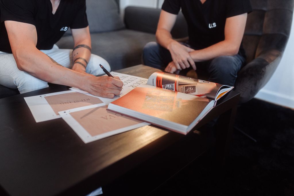
A bespoke logotype meets Premium material
We created a bespoke typeface that is inspired by old print specimens of the historic typeface ronaldson from the early 1900.
UTF YUVA has a very sophisticated, yet natural feel with some organic touches and lettershapes that reflect the shape of grapes.
The usage of only one weight combined with the minimal design visualizes the approach of the vineyard – focus on the basics, but do it great.
Image 01 & 03 by lilschk
UTF YUVA has a very sophisticated, yet natural feel with some organic touches and lettershapes that reflect the shape of grapes.
The usage of only one weight combined with the minimal design visualizes the approach of the vineyard – focus on the basics, but do it great.
Image 01 & 03 by lilschk


