

Visuelles Erscheinungsbild und Packaging Design für ein Weingut

Projektinformationen
Kunde YUVA
Our services
Markenentwicklung
Naming
Visuelle Identität
Logodesign
Grafikdesign
Schriftdesign
Packaging Design
Naming
Visuelle Identität
Logodesign
Grafikdesign
Schriftdesign
Packaging Design
YUVA ist ein neues Weingut, das den Ursprung der Traube mit einem modernen Ansatz kombiniert.

Über das Projekt
YUVA ist eine neue Weinmarke, die sich auf hochwertige und leckere Weine für eine breite Zielgruppe spezialisiert hat. Ziel ist es nicht nur die Weinexperten, sondern auch Einsteiger in diesem Bereich anzusprechen und an gute Weine heranzuführen. Aufgabe war es die visuelle Identität zu gestalten und die Marke als hochwertige Lifestyle Brand zu positionieren.
Konzept & Ziel
Die konzeptionell Leitidee war es Bezug zum Ursprung des Produkts, der Traube zu nehmen. Ziel war es ein ganzheitliches, reduziertes und einprägsames Designsystem zu erschaffen, das diesen Bezug herstellt ohne ins Klischee abzurutschen.
Der Name wurde vom lateinischen Wort für Traube - UVA abgeleitet. Um einen einprägsamen und unverwechselbaren Namen zu erhalten wurde ein Y hinzugefügt - ein Indikator für das Zusammenspiel deines Geschmacks "You" & der Marke. Die Mission von YUVA ist es die besten Trauben für den individuellen Geschmack seiner Kunden in hervorragenden Weinen zu verwandeln.
Der Name wurde vom lateinischen Wort für Traube - UVA abgeleitet. Um einen einprägsamen und unverwechselbaren Namen zu erhalten wurde ein Y hinzugefügt - ein Indikator für das Zusammenspiel deines Geschmacks "You" & der Marke. Die Mission von YUVA ist es die besten Trauben für den individuellen Geschmack seiner Kunden in hervorragenden Weinen zu verwandeln.

Du möchtest mehr über das Projekt erfahren?
Behance —
Interesse an mehr?
Auf Behance findest du eine ausführliche Case Study mit weiterführenden Informationen, die wir für das Projekt erstellt haben. Schau vorbei und lass uns wissen, was du davon hältst!


Eine individuelle Schrift trifft auf hochwertige Materialien
Für das Logo wurde eine reduzierte Logotype entwickelt, die als vollständige Schrift erweitert wurde. Diese ist inspiriert von alten, historischen Schriftmustern der Ronaldson aus dem frühen 19. Jahrhundert.
Durch die eleganten, dennoch natürlichen und humanistischen Formen wird der Markencharakter aufgegriffen. Die Tröpfchenformen und feinen Details in den Buchstaben erinnern an die Formen der Traube und nehmen so Bezug zum Konzept.
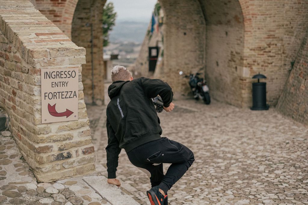
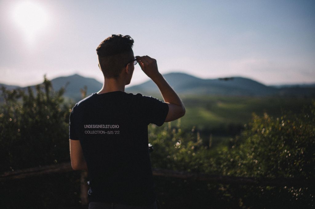
Die Fotos 01 & 03 sind von unserer befreundeten Fotografin lilschk - Danke dafür!
Durch die eleganten, dennoch natürlichen und humanistischen Formen wird der Markencharakter aufgegriffen. Die Tröpfchenformen und feinen Details in den Buchstaben erinnern an die Formen der Traube und nehmen so Bezug zum Konzept.
Die Fotos 01 & 03 sind von unserer befreundeten Fotografin lilschk - Danke dafür!


