


A new visual identity for a german holding company

Project Information
Client Patchwork Capital
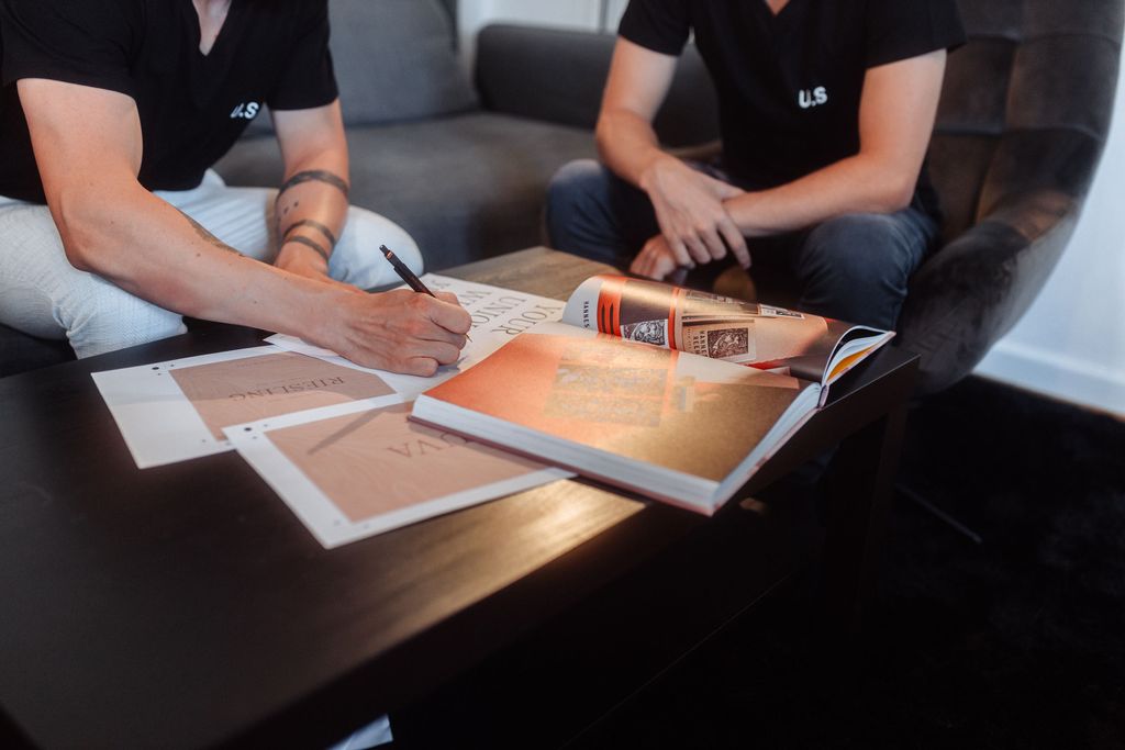
Print by Butz & Bürker
Print by Butz & Bürker
Our services
Visual Identity
Graphic Design
Portfolio Photography
Graphic Design
Portfolio Photography
Patchwork Capital is a german holding firm enabling social entrepreneurs to solve the biggest problems of our time.

About the Project
Patchwork Capital is a holding company with the mission to enable innovative companies with their experience, passion and capital to solve the biggest problems of our times.
The company is a variety of startups and more established companies, but mainly focuses on companies in the fields of social entrepreneurship.
They approached us because they recently found the company as the holding for all their businesses and needed a visual identity to represent it.
The company is a variety of startups and more established companies, but mainly focuses on companies in the fields of social entrepreneurship.
They approached us because they recently found the company as the holding for all their businesses and needed a visual identity to represent it.
Conceptual Idea and Goal
After our initial brand strategy and concept phase it was pretty clear that the goal of the new visual identity had to reflect their aspiration to create a brighter future for our planet and combine it with their innovative vision and the seriousness of an investment company.
We also wanted to add a touch of „coolness“ that reflects the people involved in the company and its holdings. Furthermore we wanted the identity to be calm and reduced, thus becoming perceived as the enabler for innovation.
We also wanted to add a touch of „coolness“ that reflects the people involved in the company and its holdings. Furthermore we wanted the identity to be calm and reduced, thus becoming perceived as the enabler for innovation.
We are proud that the new identity for Patchwork Capital got some international recognition
Behance — Fonts in Use — Römerturm —
Interested in more?
We created a behance case study with some more information about this project. The project also got featured on Fonts in use and the Römerturms creators club. Check it out and let us know what you think!


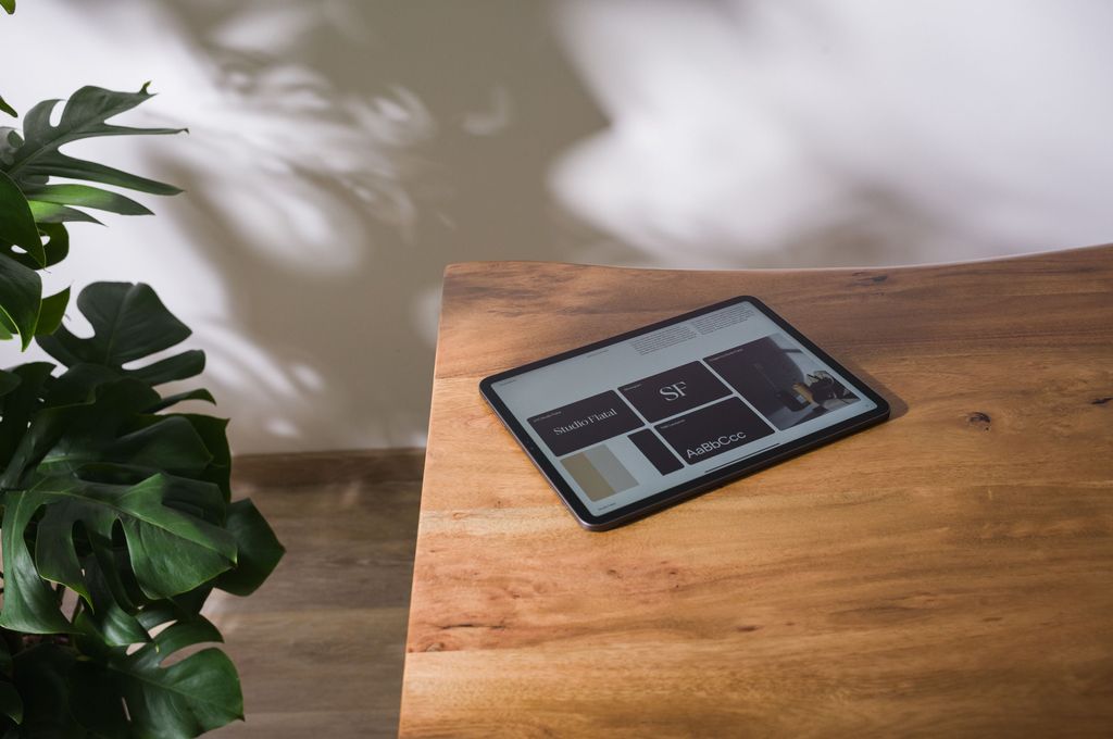
A consistent look and feel throughout all touchpoints - both analog and digital.


Design & Print Details
ABC Arizona matches the sustainable and human personality of the company. Due to its variable features it can interpolate between sans and serif - abstracting both the human touch, the focus on innovative startups and the knowledge and seriousness of an investment company. With the strong and unique personality it helps to achieve a reduced layout, thus enabling Patchwork Capital to position itself in the background of the holdings without losing the brand awareness.
The color scheme with blue as the primary color abstracts innovation, experience and reliability. It is calm and sits in the background. Mixing both a dark and lighter shade of the color creates a calm composition and reflects the coolness of the people behind the brand.
In printed materials the brand uses Cool Blue and Imperial Blue of the Colorplan line, combined with Luxor 302 foil. That reflects the high aspiration, the passion of the company and the team behind it. Furthermore the physical structure and haptic feeling expresses the personal approach of the company.


