Visual identity for a fitness and lifestyle brand

Project Information
client no days off®
Services
Visual identity
Logodesign & Typeface design
Art- & Creative Direction
Graphic Design
Social Media
Photography
Logodesign & Typeface design
Art- & Creative Direction
Graphic Design
Social Media
Photography
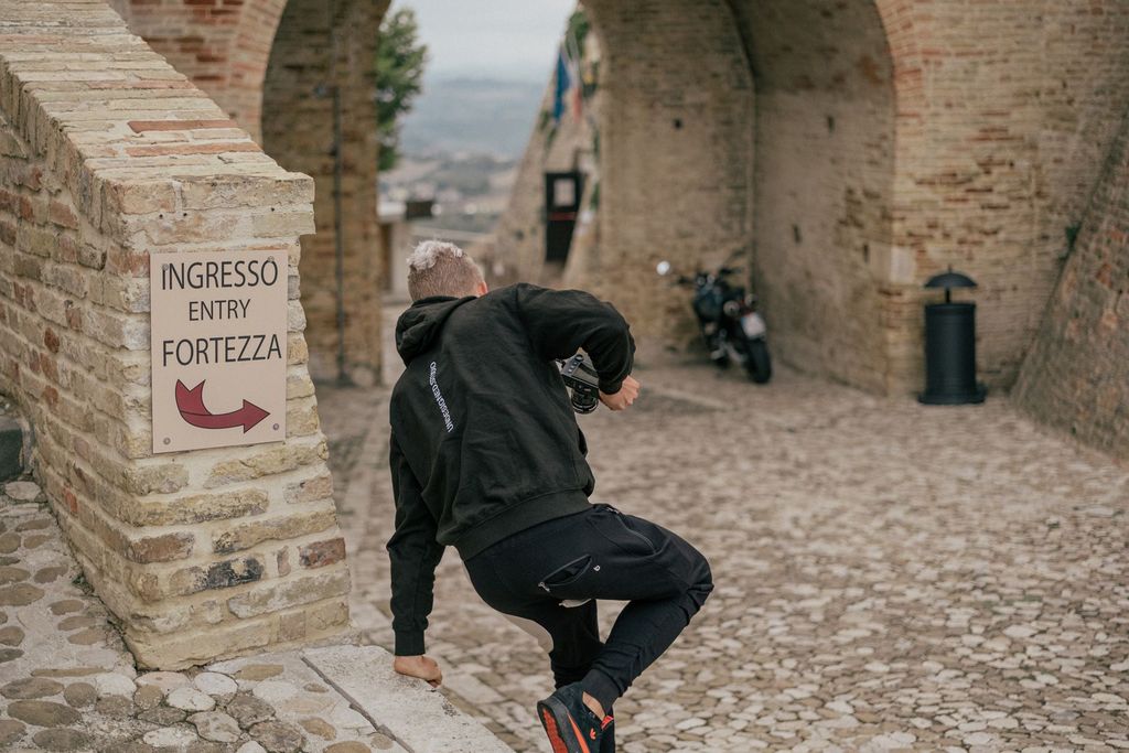
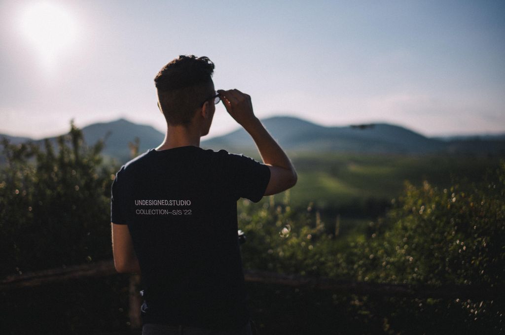
no limits. no excuses. no days off®. It’s more than fitness. It’s a lifestyle.

About
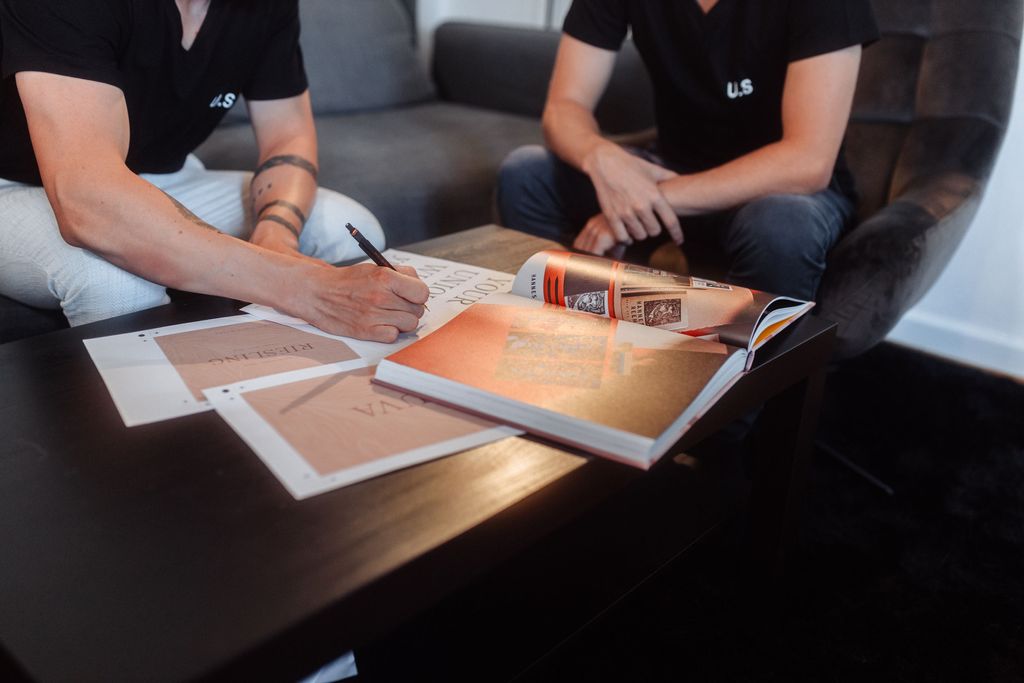
We were asked to create the new brand identity for no days off®, a newly established fitness brand out of germany. The initial goal of the brand was to act as a community and attract new people to become part of it. Furthermore it needed to have enough freedom to work as an umbrella for all the future projects that might come, for example coachings, events, supplements and merchandise articles.
Conceptual Idea and Goal
We created a cohesive and minimalist visual identity that offers a lot of flexibility to be contrasted with the different visual directions of future products. To archive brand recognition we created a bespoke variable typeface that can change width depending on the context, thus abstracting the movement of the body. The unique logotype has a friendly, open character that stands for the community aspect of the brand. Furthermore the symbol was designed as simple as possible, thus people can scribble it by hand to showcase the different people that are part of no days off®


Interested in more? View the full case study on behance
Behance —
Further information
You can find the full case study of the project with all the information on our Behance profile.
