Visual identity for an interior design studio

Project Information
Our services
Branding & Visual Identity
Typeface Design
Logo Design
Graphic Design
Print & Packaging Design
Typeface Design
Logo Design
Graphic Design
Print & Packaging Design
Studio Fiatal is a german premium manufacturer for emotional & aesthetically pleasing interior objects.

About the Project
Studio Fiatal is a young furniture manufacturer that specializes in the design and creation of unique premium furniture with a focus on high quality and aesthetic. The studio’s goal is to design furniture objects with soul that allows their target audience to express their personality and desire of a nice aesthetic.
They manufacture only a small quantity of products and try to establish a timeless design with longevity. All the materials that are used for the objects are locally crafted and sustainable produced along the entire value chain. This supports local companies and the environment.
We helped Studio Fiatal to create a unique brand identity system that puts the furniture in the focus and expresses their values, vision and aspiration to their audience.
Conceptual Idea and Goal
The conceptual goal was to create a cohesive identity system that puts the beautiful interior objects in the spotlight.
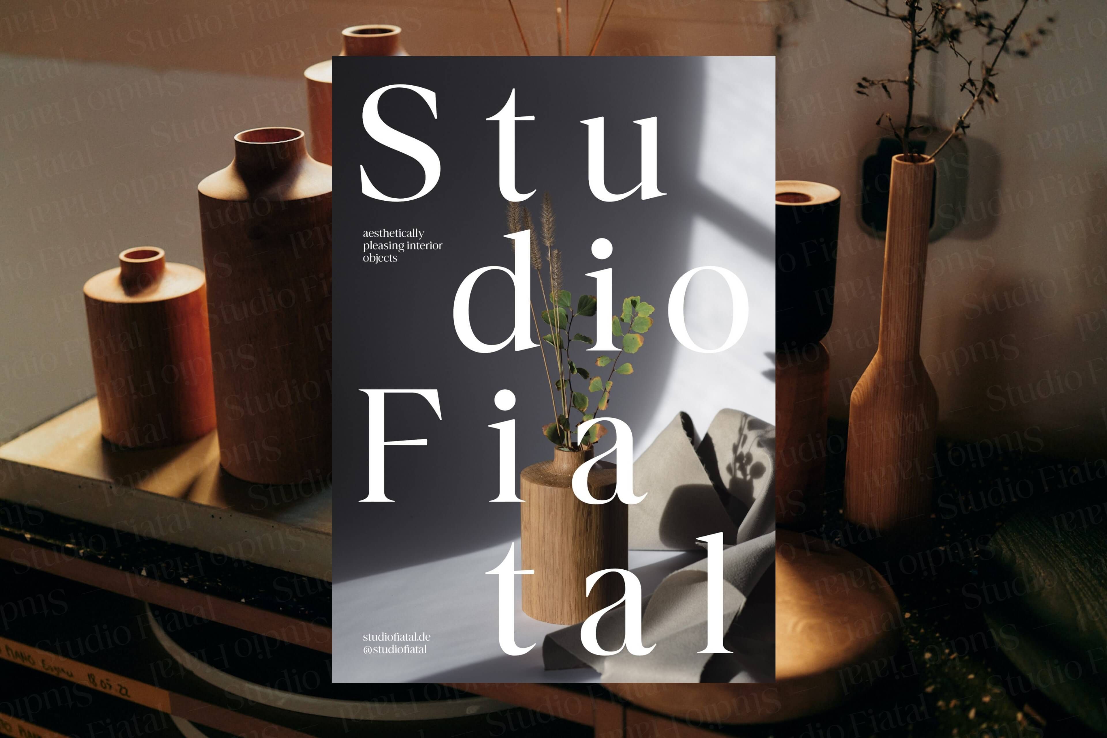
We designed an expressive bespoke logotype as the hero element of the visual identity, that’s flexible and can be used as a design element to complement the emotional product photography. The overall look and feel is reduced, timeless, but still not too cold. With that contrast the identity underlines the brands ambition to manufacture interior objects that express the aesthetic style of the audience.
We designed an expressive bespoke logotype as the hero element of the visual identity, that’s flexible and can be used as a design element to complement the emotional product photography. The overall look and feel is reduced, timeless, but still not too cold. With that contrast the identity underlines the brands ambition to manufacture interior objects that express the aesthetic style of the audience.

You can find out more about this project on our behance profile
Behance —
Interested in more?
We created a behance case study with some more information about this project. Check it out and let us know what you think!


A cohesive identity system that puts the beautiful interior objects in the spotlight


Design Details
The bespoke logotype abstracts the emotional and warm character of the furniture. It helps building brand recognition and gives the studio a distinctive and unique character without harming the minimalist design language with the objects as the main brand driver. The letter shapes have a humanist, art nouveau inspired and modern interpreted character that give the brand a comfy, warm and emotional feeling.
A subtle dynamic axis underlines the vision to bring a fresh player into the market. The typeface establishes every written word as a brand ambassador.
The warm color scheme gets complemented by GMUND Cotton natural beige and linen cream - both abstracting the studios value of sustainability and local partners across the entire value chain of the products. The brands ambition gets visible by the usage of KURZ Luxor 429N Relieffoil.