Visual identity and packaging design for a speciality cafè and roastery

Project Information
Client Limited
Our services
Branding & Visual Identity
Graphic Design
Typeface Design
Packaging Design
Graphic Design
Typeface Design
Packaging Design
LIMITED is a speciality cafè and roastery that focuses on premium and exclusive espresso beans.

About the Project
LIMITED is a speciality cafè and roastery that focuses on premium and exclusive espresso beans. Their mission is to share the love of good coffe and the diversity of different beans with their audience. Their positioning is specifically targeted to coffee connoisseurs who care about fair produced coffee and are open to try out new beans. As the name implies the focus of LIMITED is on limited edition roasts. That enables them to experiment with different flavors, coffee varieties and share the huge variety of speciality coffee with the world.
Conceptual Idea and Goal
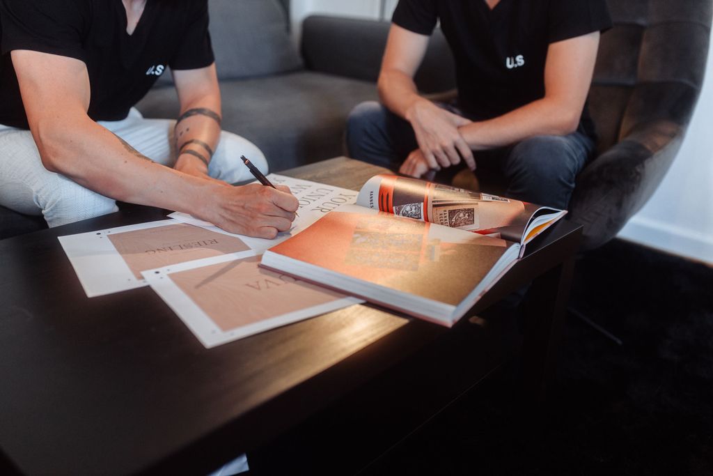
Our concept for their branding was to create a very minimalist visual identity that puts the product in the focus. A bespoke created logotype that turned into a fully typeface enables the new brand to create a distinctive look just by using type to create brand awareness. A laid back color palette inspired by earthy tones and coffee beans works together with premium papers of the G.F Smith Colorplan lineup to express the premium and exclusive character of the brand.

You can find out more about this project on our behance profile
Behance —
Interested in more?
We created a behance case study with some more information about this project. Check it out and let us know what you think!


A bespoke logotype meets Premium material
New new brand is all about the coffee and the beans. That lead us to the concept of an ultra minimalist design with a bespoke logotype at the core that expanded into a fully functional custom typeface. This enables the brand to create brand recognition with every word written and strengthens the theme of exclusive & premium coffee roasts without cluttering the design.


