Patchwork Capital
Holding Group Branding
CHALLENGE
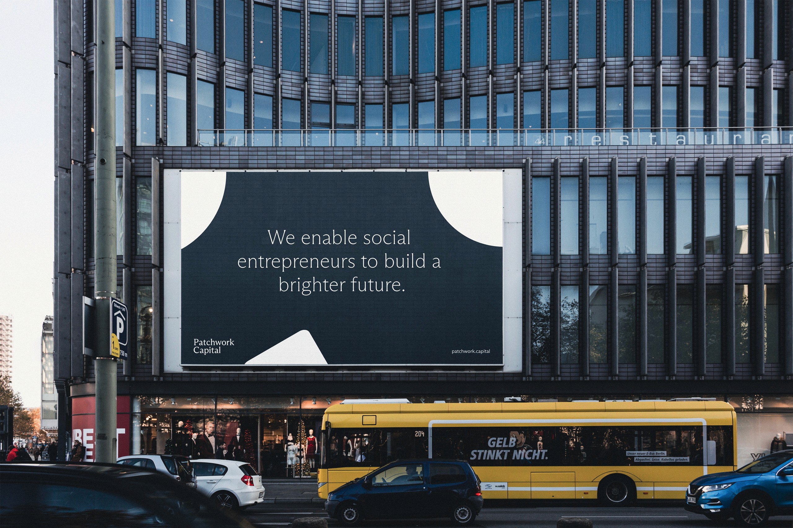
Patchwork Capital is a holding company with the mission to enable innovative companies with their experience, passion and capital to solve the biggest problems of our times. The company is a variety of startups and more established companies, but mainly focuses on companies in the fields of social entrepreneurship. They approached us because they recently found the company as the holding for all their businesses and needed a visual identity to represent it.
SOLUTION
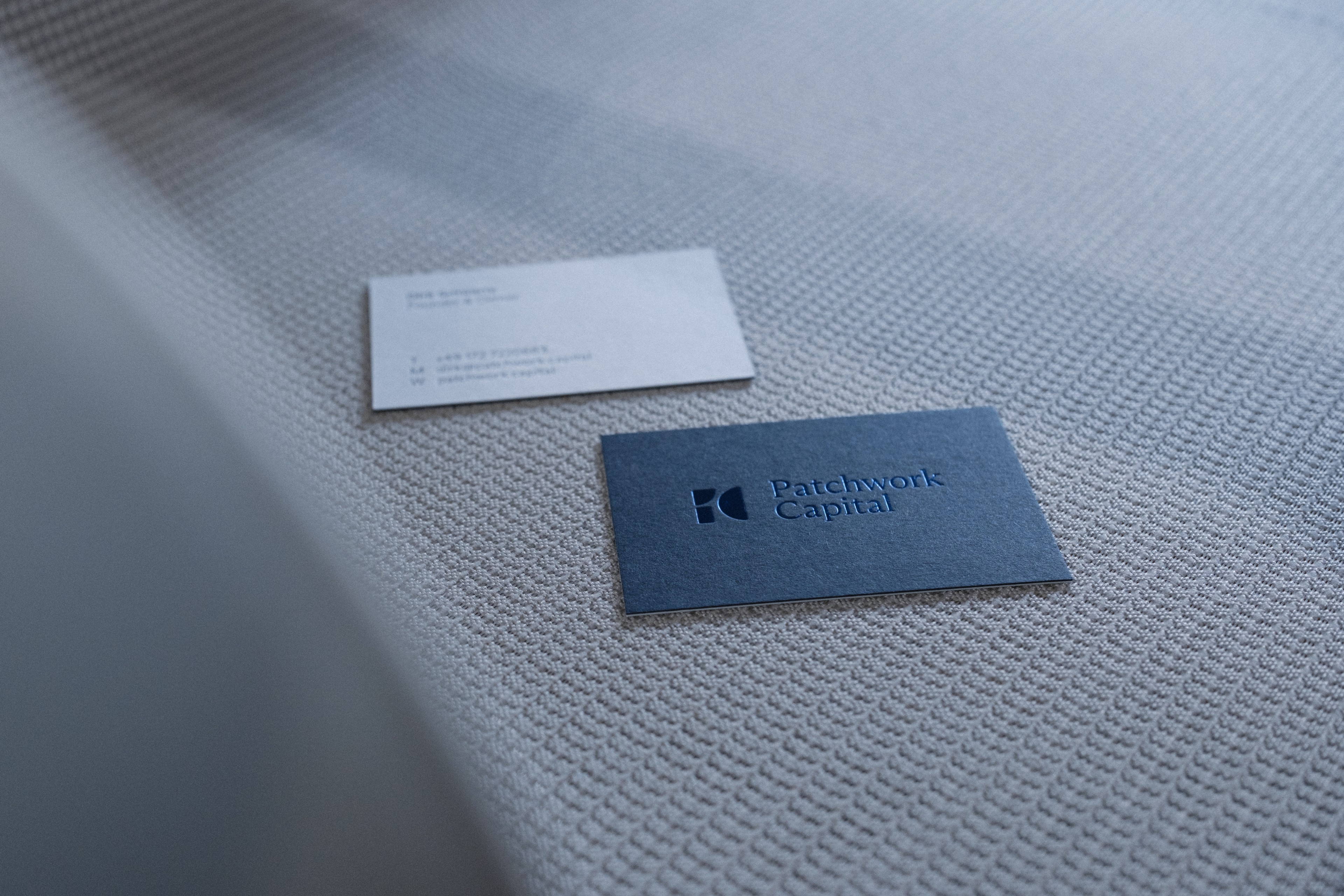
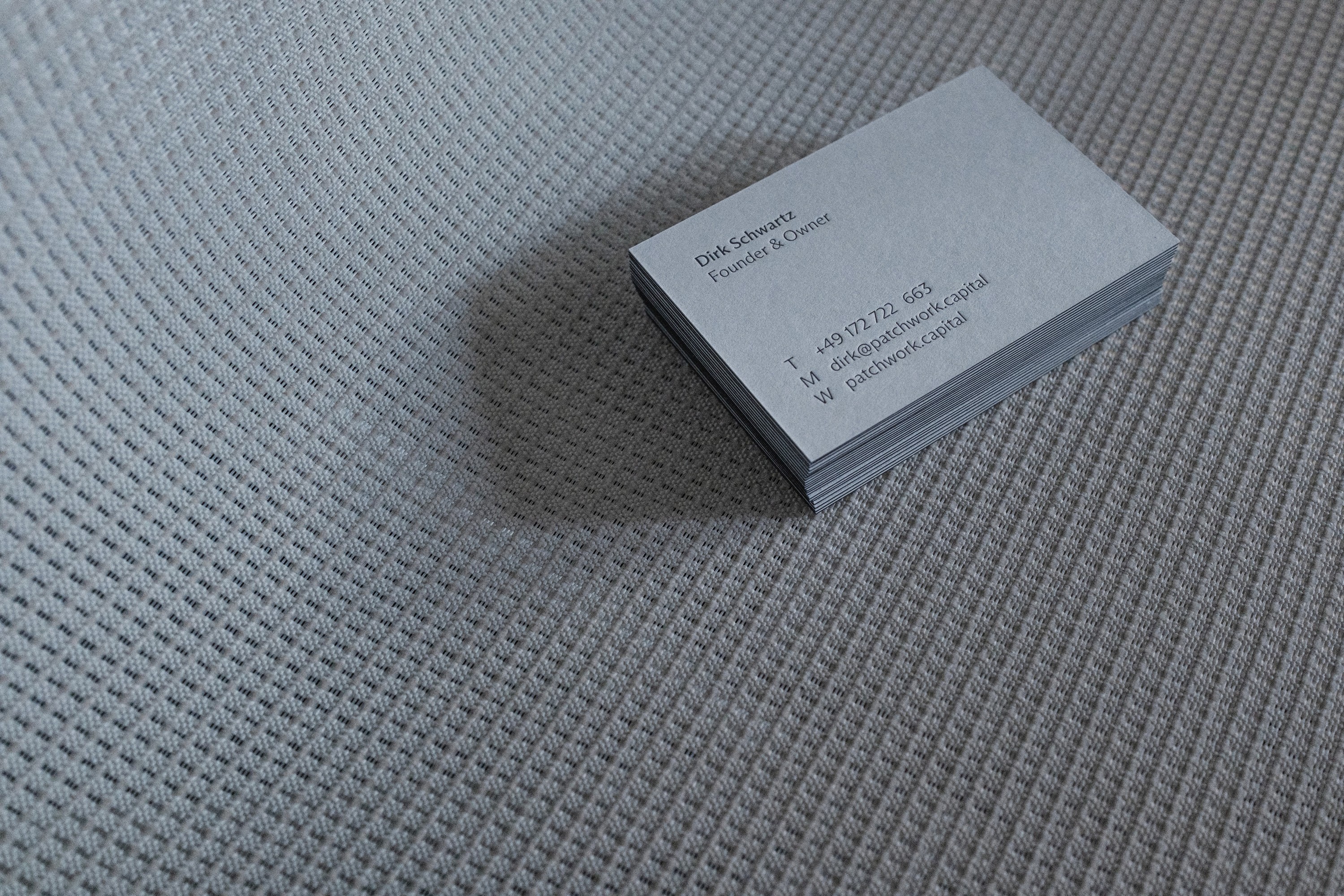
We designed the visual identity as a flexible system, paying tribute to the name and the personality of Patchwork Capital. After the branding phase we designed their new website and different print materials like business cards, letter heads, envelopes and more. Everything was documented in an extensive brand manual that helps their internal marketing team to work with the brand.

the journey how we got there
Brand Strategy
After started the project with a brand questionnaire that laid the foundation of the process. After our initial brand strategy and concept phase it was pretty clear that the goal of the new visual identity had to reflect their aspiration to create a brighter future for our planet and combine it with their innovative vision and the seriousness of an investment company.
We also wanted to add a touch of »coolness« that reflects the people involved in the company and its holdings. Furthermore we wanted the identity to be calm and reduced, thus becoming perceived as the enabler for innovation.
Brand Design
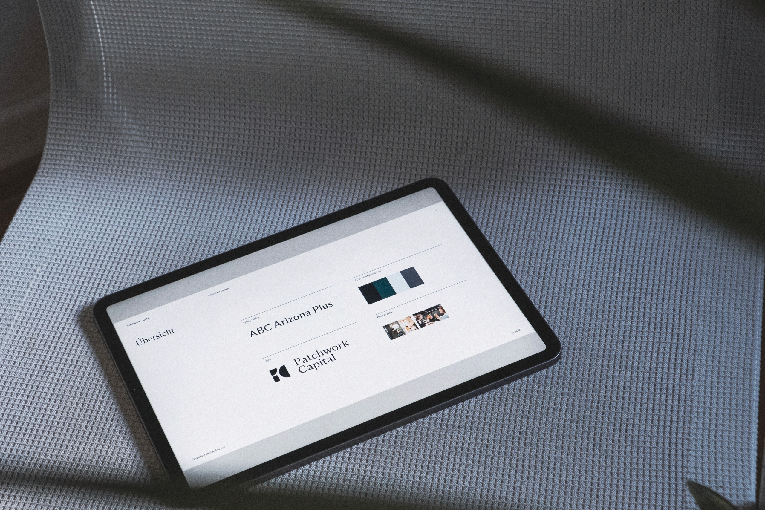
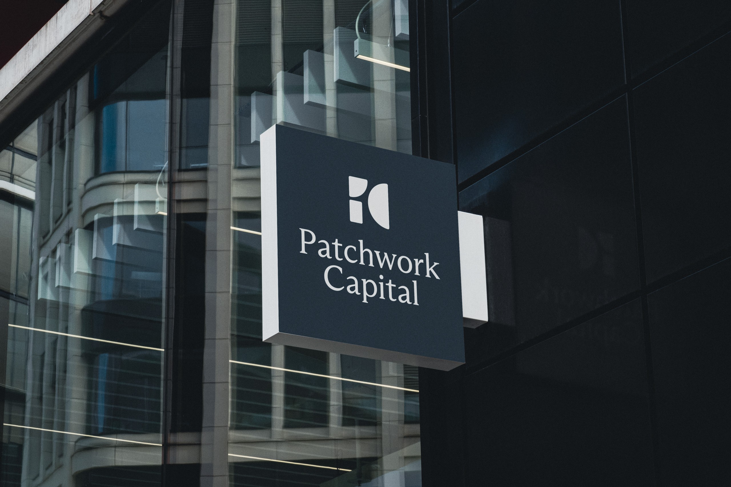
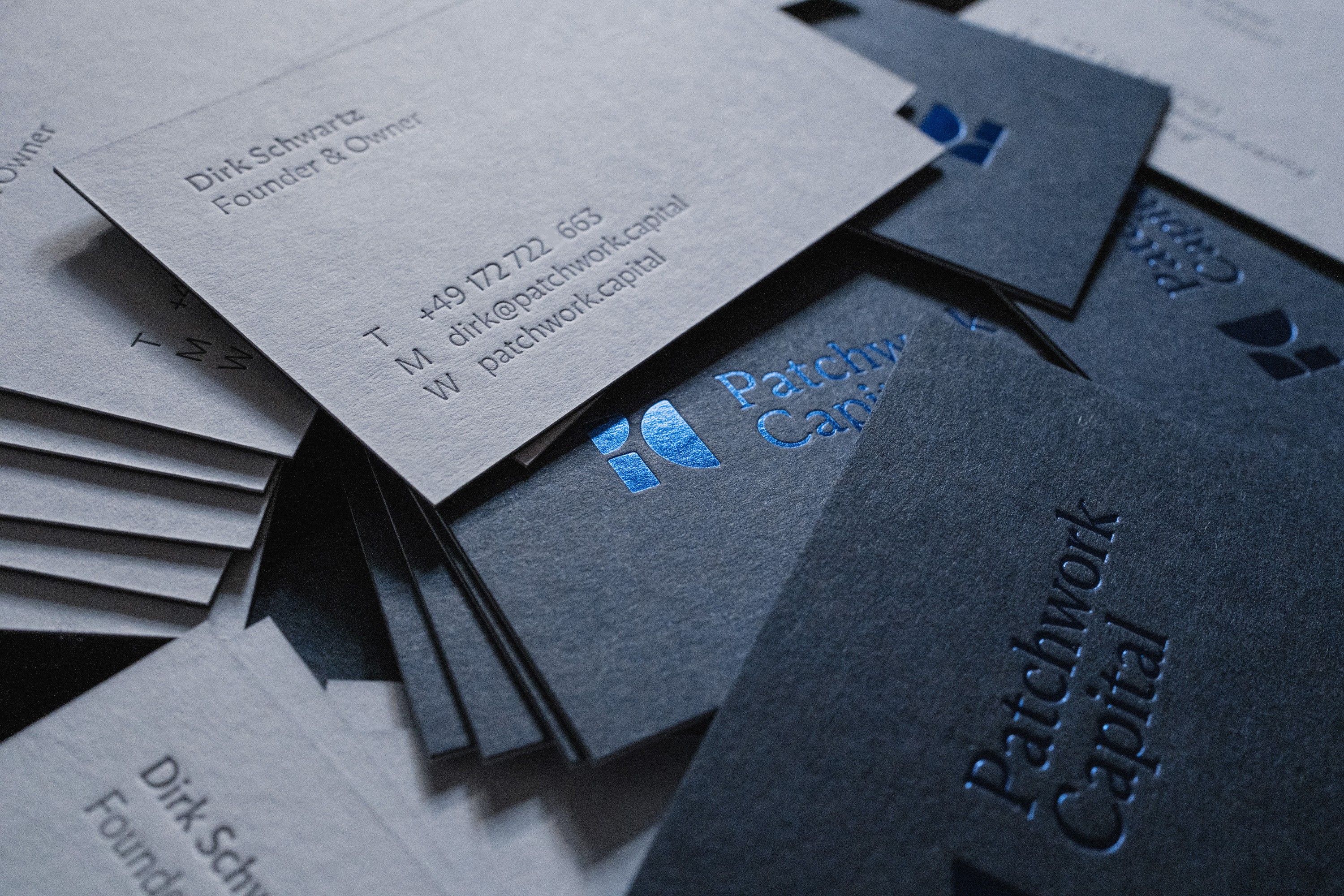
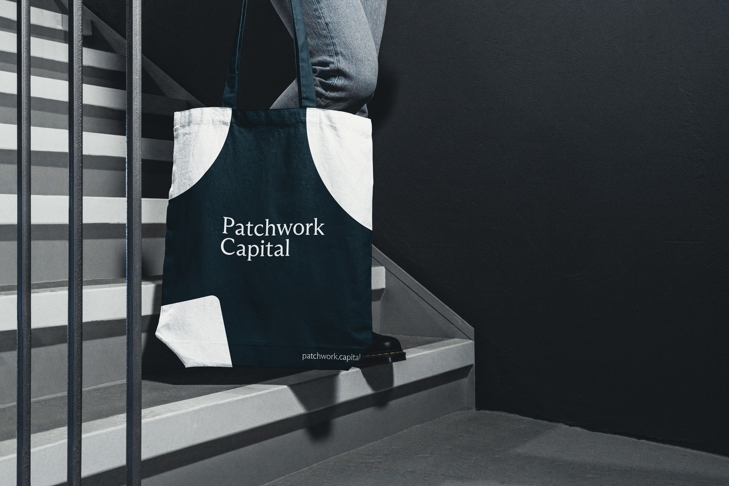
Patchwork pays tribute to the name, the personality of the founder and abstracts the companies holdings - different companies come together under the roof of Patchwork Capital to do great. A clean typeface, a minimal color scheme and high quality print finishes holding together the visual identity. Friendly. Reserved. Premium. And as dynamic as their investments itself.
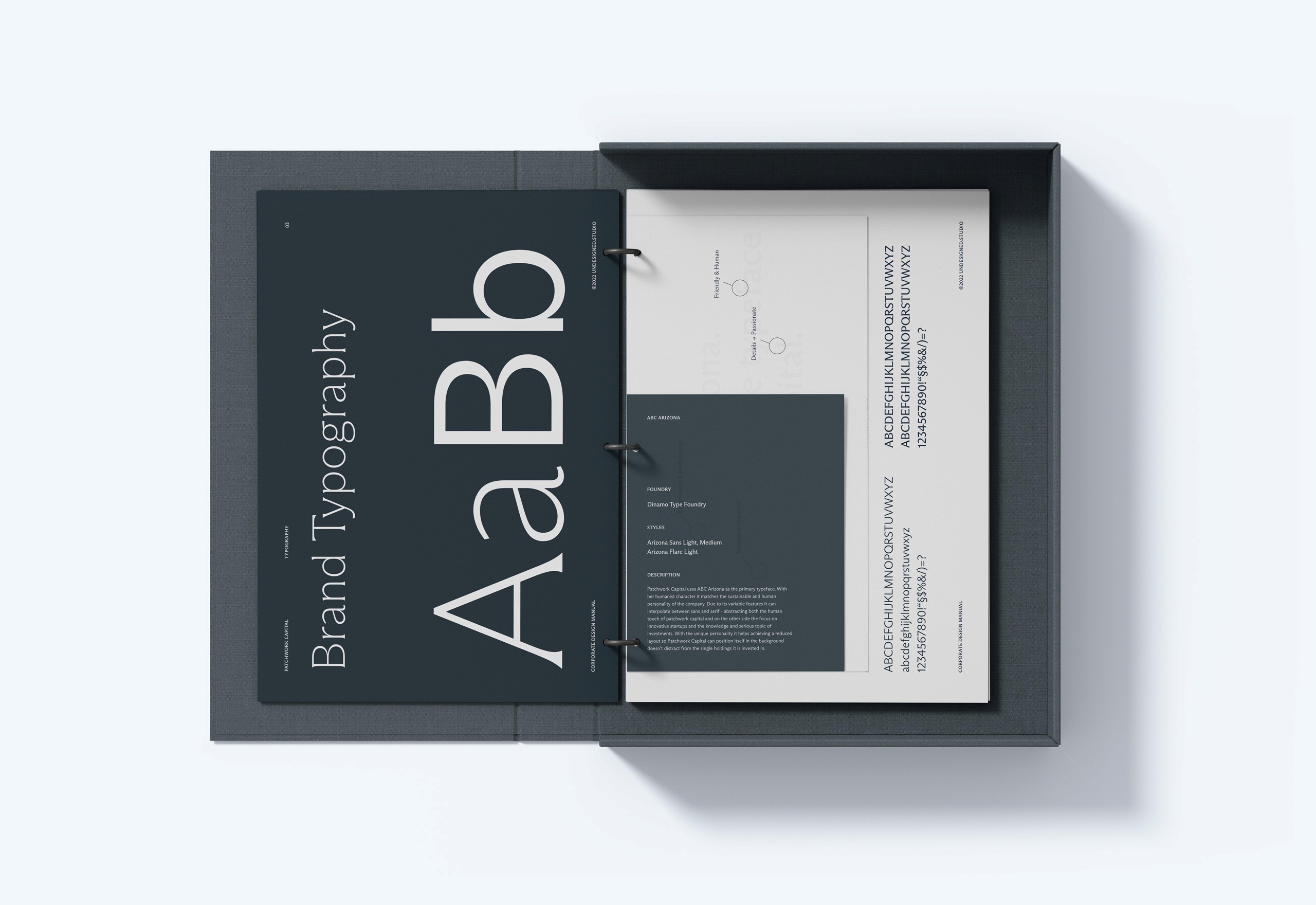
Patchwork Capital uses ABC Arizona as the primary typeface. With its humanist character it matches the sustainable and human personality of the company. Due to its variable features it can interpolate between sans and serif - abstracting both the human touch of patchwork capital, the the focus on innovative startups and the knowledge and seriousness of an investment company. With the strong and unique personality it helps to achieve a reduced layout so Patchwork Capital can position itself in the background of their holdings and still create enough brand awareness without using cluttering design.
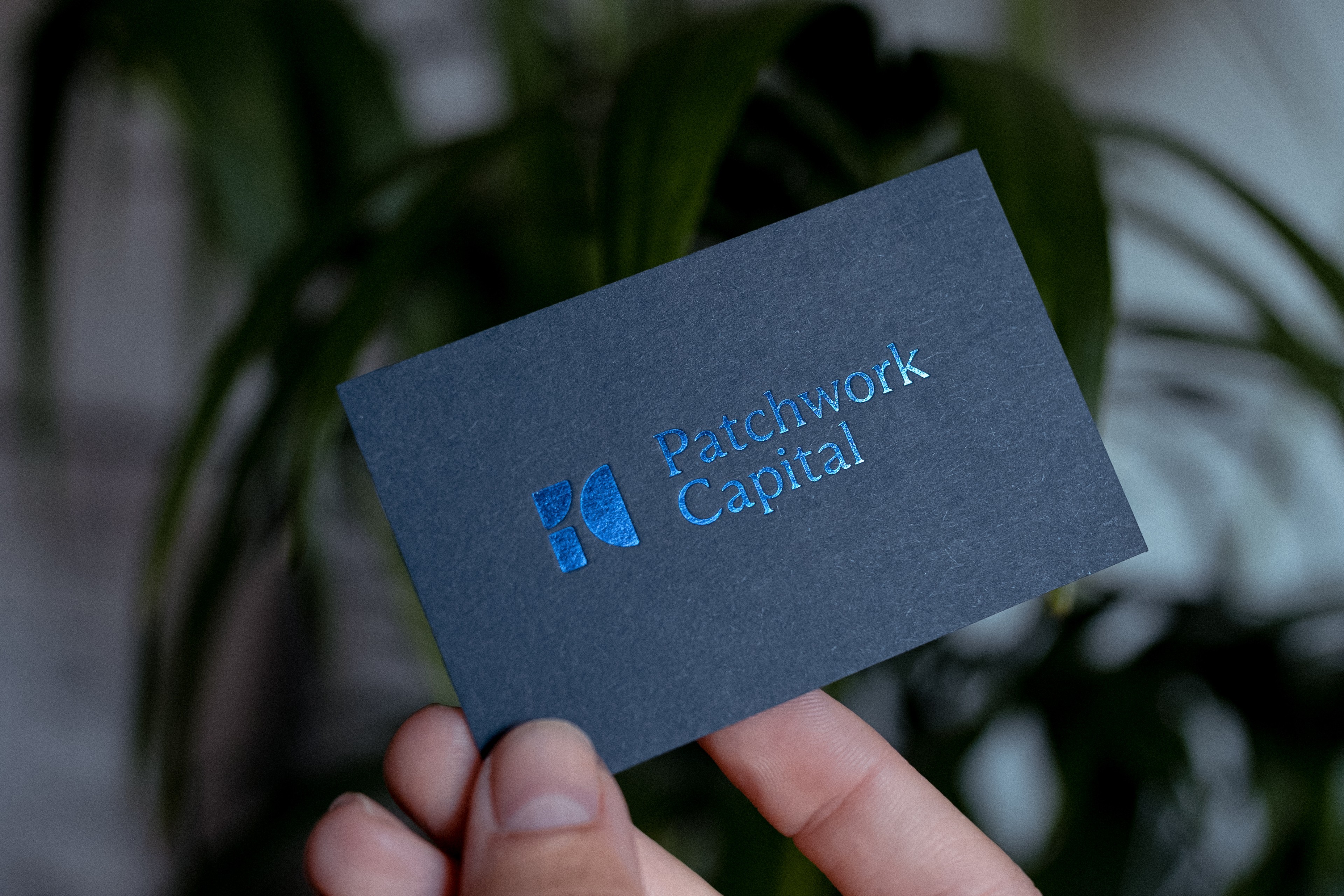
The reduced color scheme with blue as the primary color stands for innovation, experience and reliability. It is calm and sits in the background, so the focus lies on the holdings. Mixing both a dark and lighter shade of the color creates a calm composition and reflects the coolness of the people behind the brand.
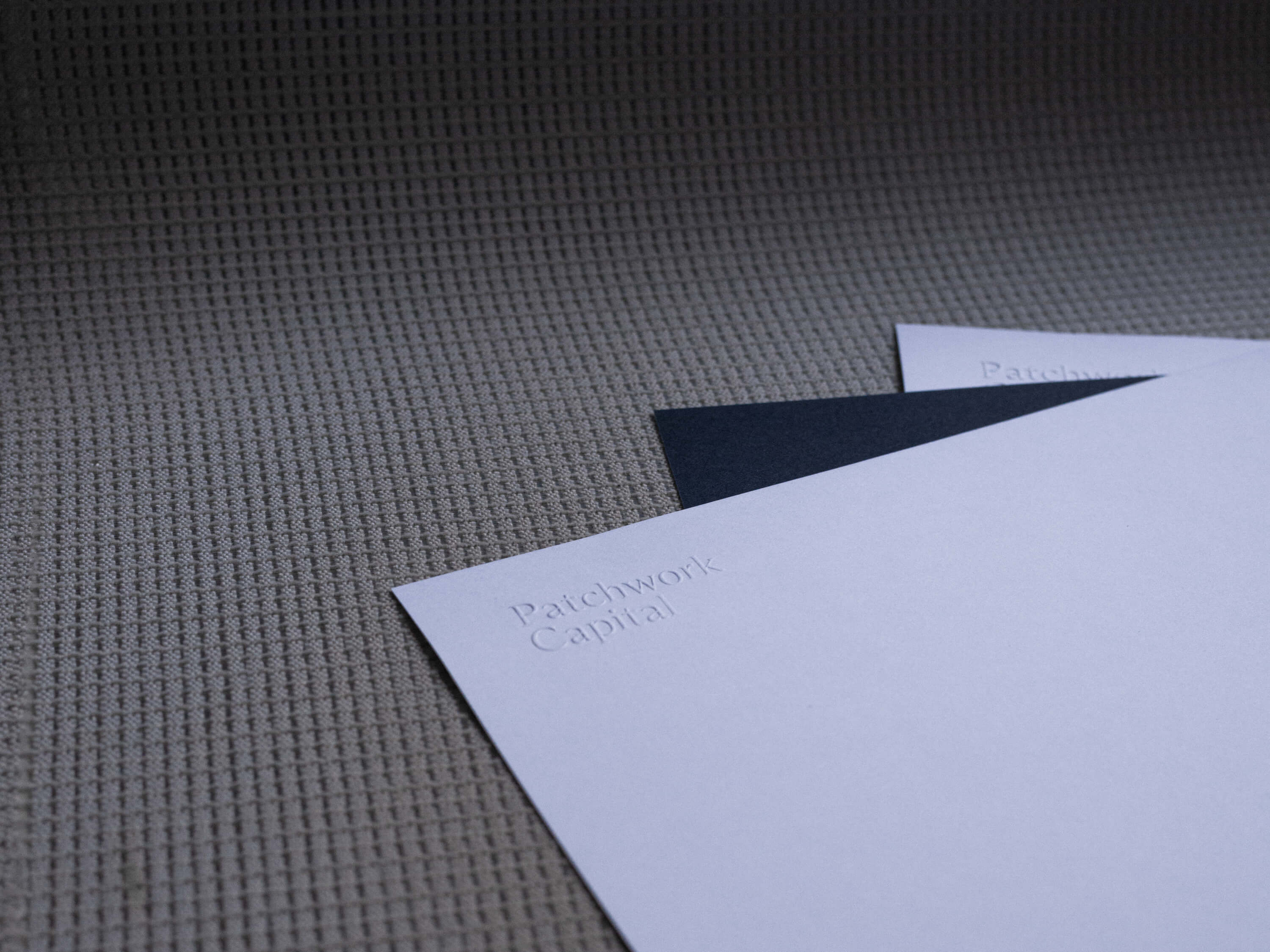
In printed materials the brand uses Cool Blue and Imperial Blue of the Colorplan line, combined with Luxor 302 foil. That reflects the high aspiration and the passion of the company and the team behind it. Furthermore the physical structure and haptic feeling expresses the personal approach of the company.